
กำลังมองหาวิธีทำสิ่งเหล่านี้อยู่รึป่าว?
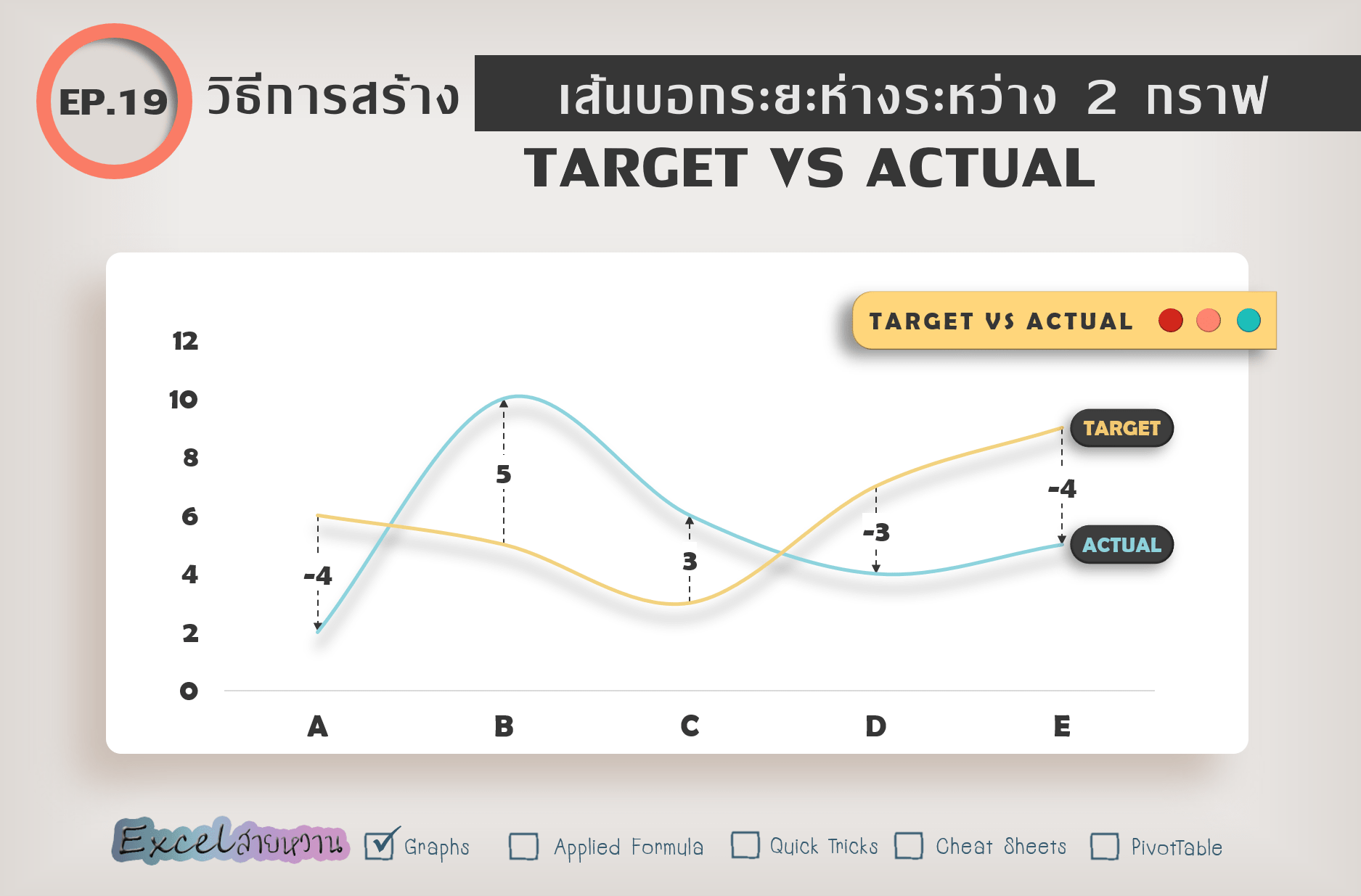
ใส่เส้นบอกความห่างระหว่างกราฟเส้น
ใส่ Labels บอกความต่างระหว่าง Target กับ Actual
เส้นและตัวเลขปรับตามกราฟแบบอัตโนมัติ
ถ้าใช่ ต้องอ่าน EP นี้
EP19 ตอนที่ 1 วิธีการสร้างเส้นบอกระยะห่างระหว่าง 2 กราฟ
ต้องบอกก่อนว่าวิธีนี้เป็นหนึ่งในหลายๆ วิธีที่สามารถบรรลุเป้าหมายเดียวกันได้ (ต้องใช้ Excel Version 2013 ขึ้นไป) แต่จากที่ลองมาหลายๆ วิธี ใช้ได้บ้างไม่ได้บ้าง แอดชอบวิธีเป็นพิเศษและส่วนตัวคิดว่าง่ายที่สุด
ไม่ใช่แค่ง่ายต่อการทำ Variance (ผลต่าง) แบบไม่แบ่งสี แต่ง่ายต่อการทำแบบแบ่งสีด้วย! เช่น
+ สีเขียว
– สีแดง
หรือ Actual มากกว่า Target สีเขียว
Actual น้อยกว่า Target สีแดง
EP นี้เป็นการใส่ Variance แบบไม่แบ่งสี หมายความว่า ไม่ว่า Variance จะเป็น + หรือ – เส้นจะเป็นสีเดียวกัน
ลุยเลยยย!


Responses